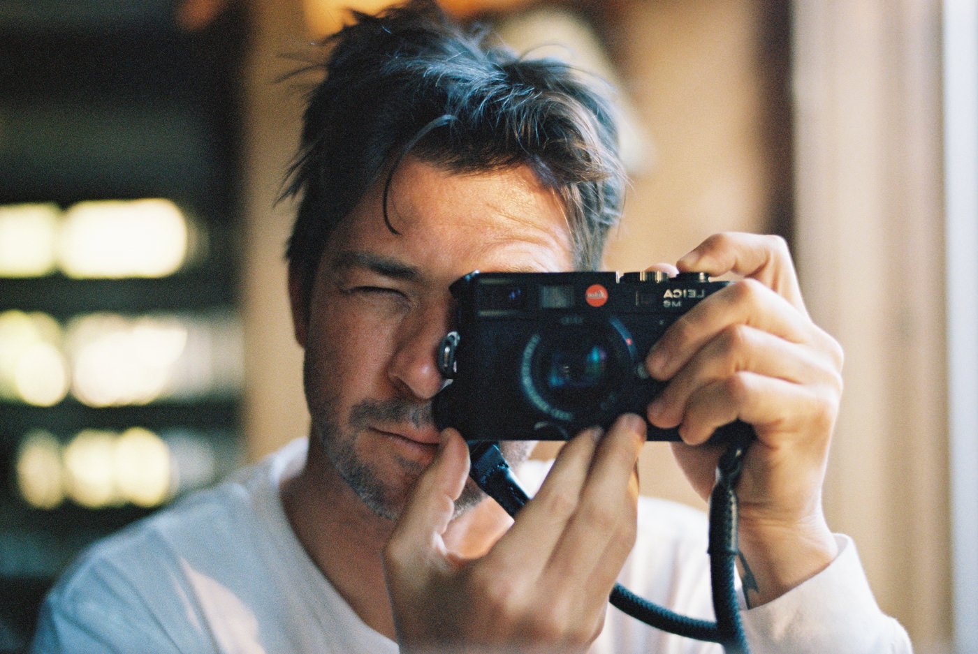
For the past decade I’ve been shooting Kodak Portra 400 pretty much exclusively for my film. Every 20-30 rolls, I throw in a roll or two of Kodak Tri-X 400 to mix it up haha. Kodak Portra 400 is such a great, versatile and beautiful film. I wanted to share some of my best tips on how to use it.
WHY PORTRA 400?
It’s definitely not the cheapest film. Especially with today’s skyrocketing film prices. I do believe it’s worth the extra couple dollars per roll though if you shoot it right. It gives you a lot of flexibility and beautiful colors and sharpness. If you’re going to spend the time and money shooting and processing film, I think it’s worth a couple extra bucks up front to make sure you get the best possible results. This is all my personal opinion, but as you’ll see, I LOVE Portra. It’s worth googling examples of different film stocks and seeing what film colors and vibe are right for you. For me, it’s always been Portra.
Pick the right SIZE/format of film
First up, make sure you get the right size. There are two main sizes of film and your camera only takes on of them. Either Medium Format 120 film (the big rolls), or the more common 35mm rolls. If you’re not sure what your camera takes, a quick Google search should give you the right answer.

Shop for Kodak Portra 400 in 120 | Moment
Shop for Kodak Portra 400 in 35 | Moment
Shop for Film Cameras | KEH affiliate link
Shop all my favorite camera gear | Amazon affiliate link
SET your light meter
Whether you’re using an external light meter, or the one built in to the camera, you need to adjust the ISO on it so you get accurate readings. This means you need to change the dial to typically 400 for Portra 400. However, I like shooting Portra 400 at 320. This means I rate the film at 320. What’s that do? It basically gives the film an extra 1/2 stop of light. I find film in general and specifically Portra does better when it’s a tad overexposed. It makes the colors pop a bit more and reduces the chances of any muddy shadows. By setting my light meter to 320 ISO it helps me stay more in the green box below, erring on the side of overexposure, which film can handle a lot better than being underexposed (see the left muddy size of the chart below).

Chart provided by PetaPixel and Carmencita Film Lab.
SHOOTING THE FILM
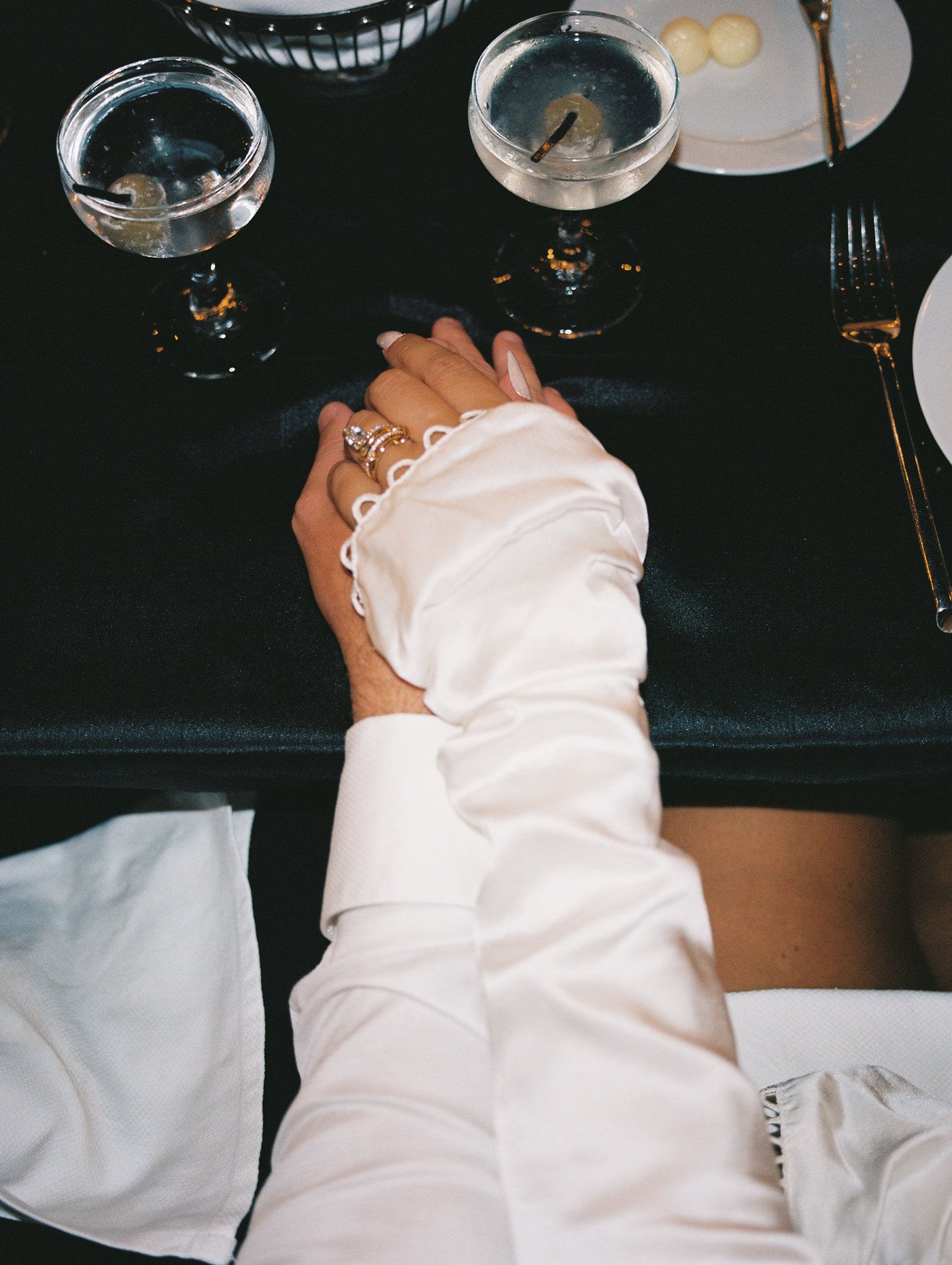
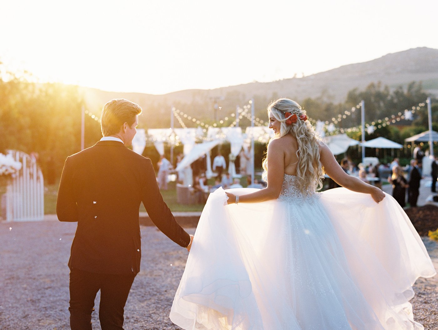
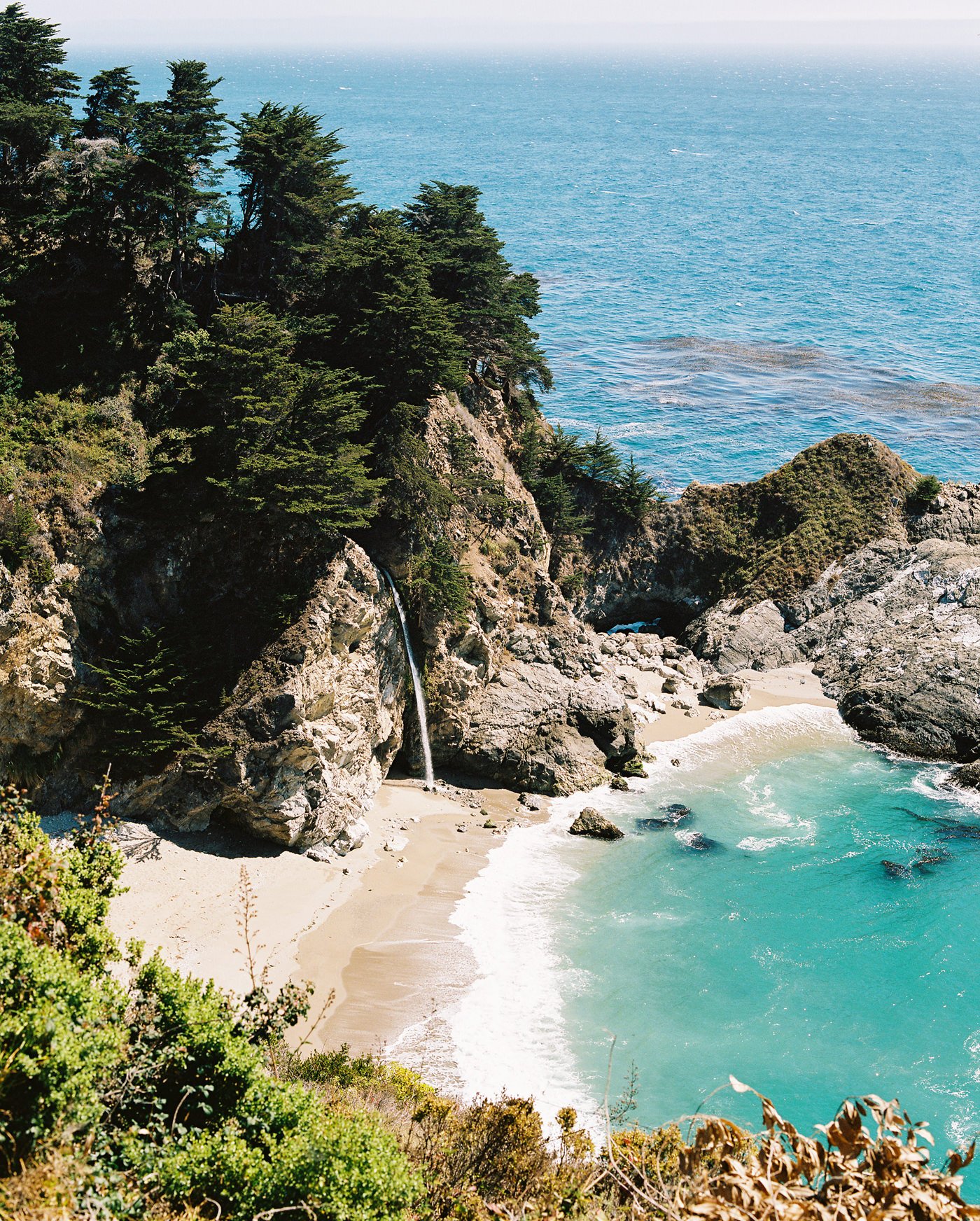
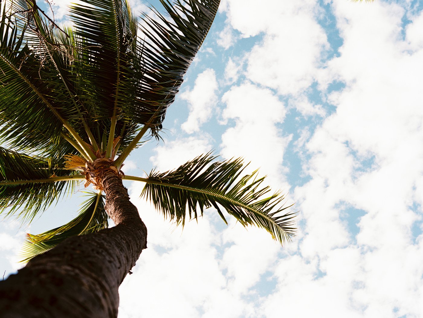
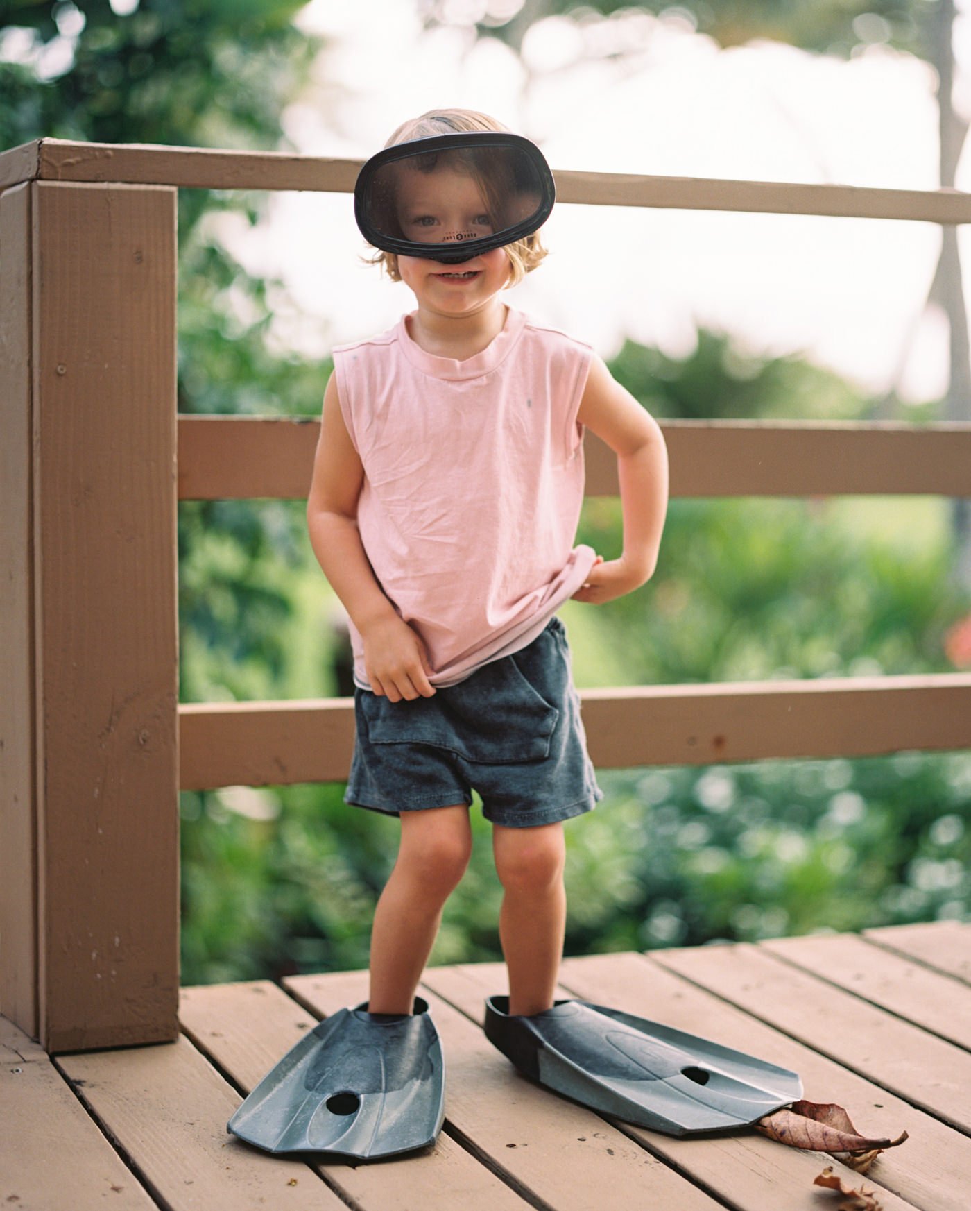
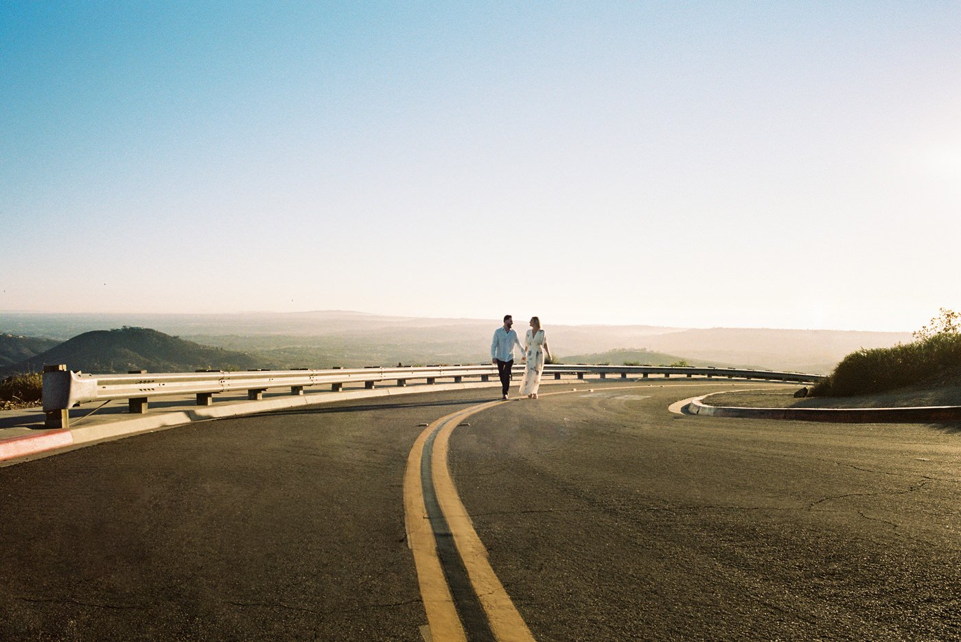
Okay, you’ve chosen the right size film, you’ve loaded up your camera, set your light meter to 320 and you’re ready to go. Now it’s time to shoot away. To me, shooting good photos is about finding good light. What does that mean? An easy example is golden hour (the hour right after sunrise, or the hour before sunset). The light gets a lot softer (meaning the area of the brightest parts are much closer to the darker parts of a scene). If you shoot mid-day in full sun, the brightest parts of a scene and the darkest shadows have a massive contrast making for harsh light and unfavorable looks in my opinion. Good light can also mean interesting light. Maybe you’re using that harsh light to your advantage, or you use a giant window to soften the light. Either way, finding good and interesting light is going to be a huge step in capturing a great photo. Especially on film, since it’s much harder to fix with heavy editing.
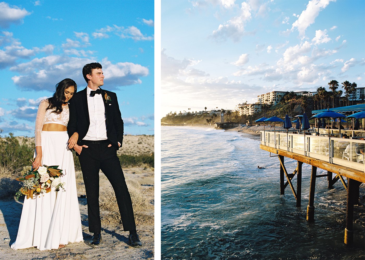
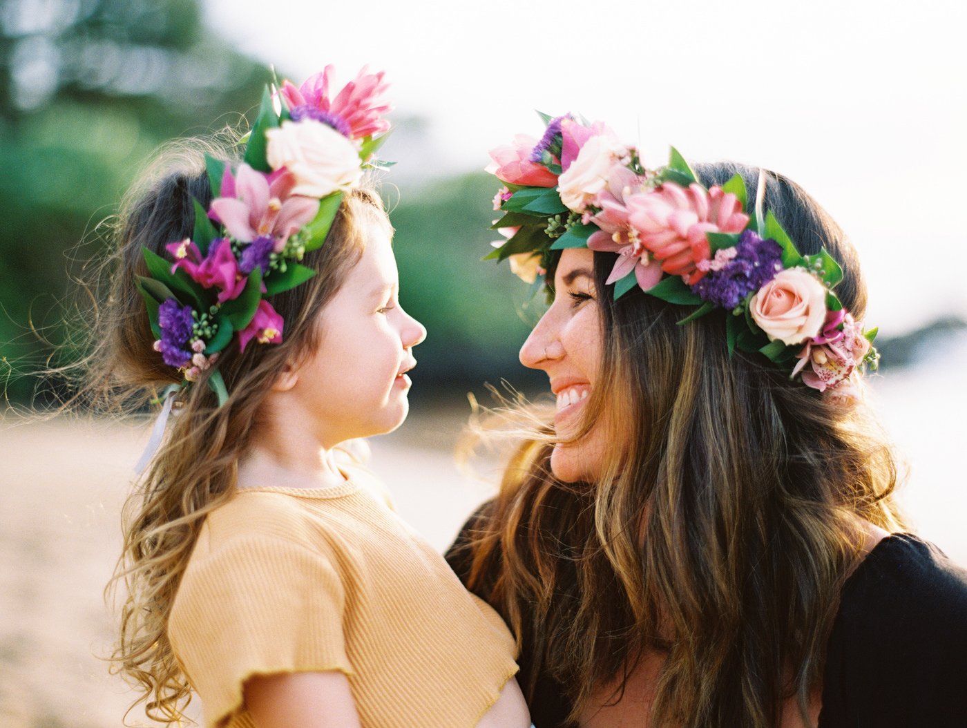
Both images shot of Portra 400 at golden hour. Just pure perfection.
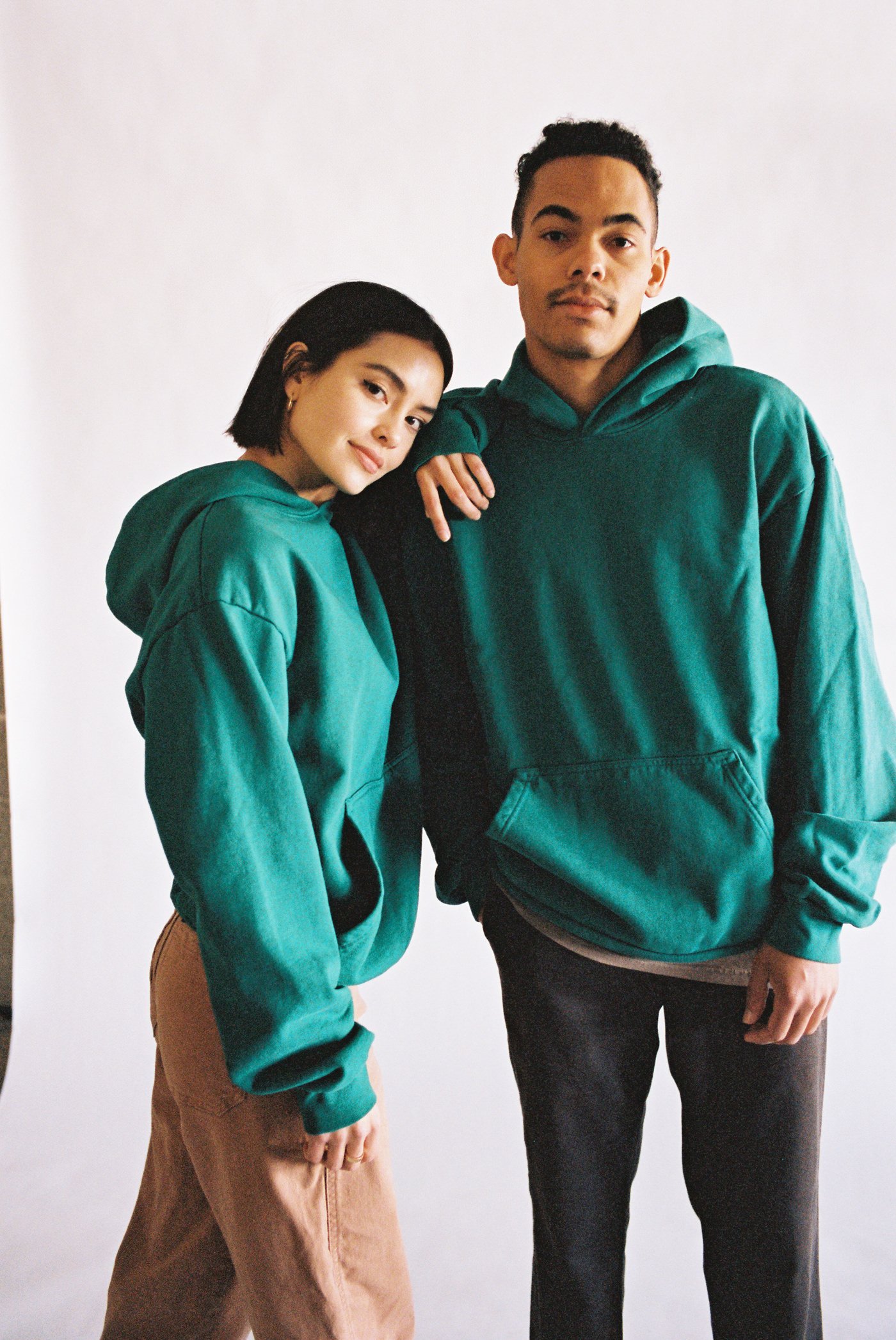
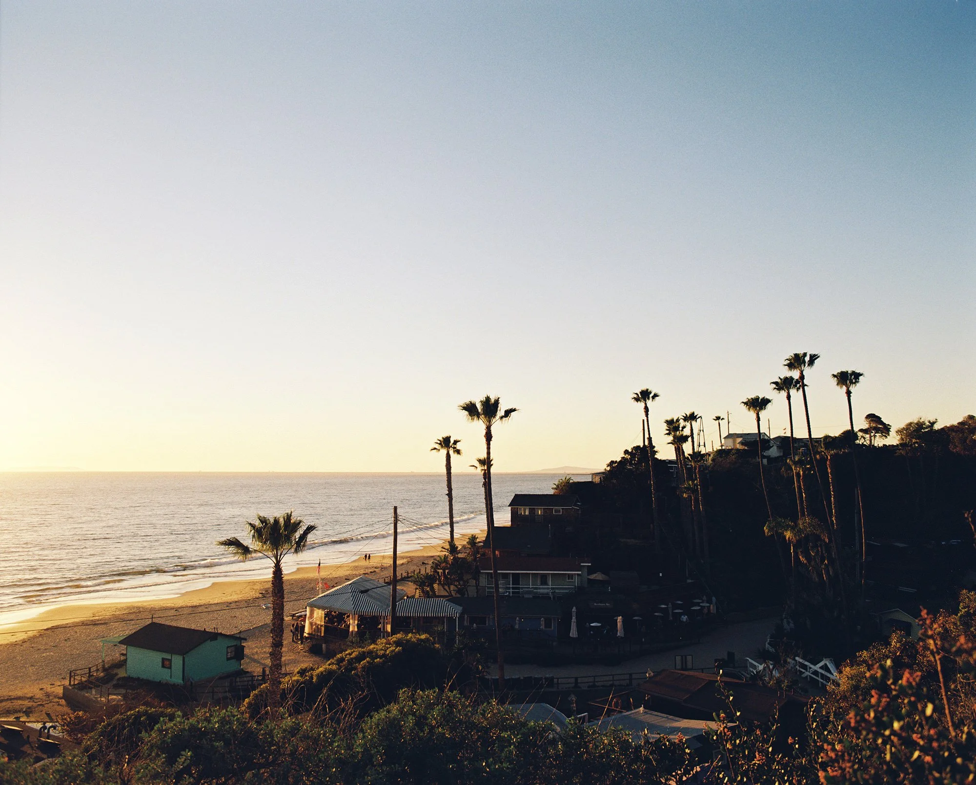
GOOD LIGHT
This is where Portra 400’s beautiful colors and skin tones truly shines. When it’s nice and sunny out and in that golden hour window.
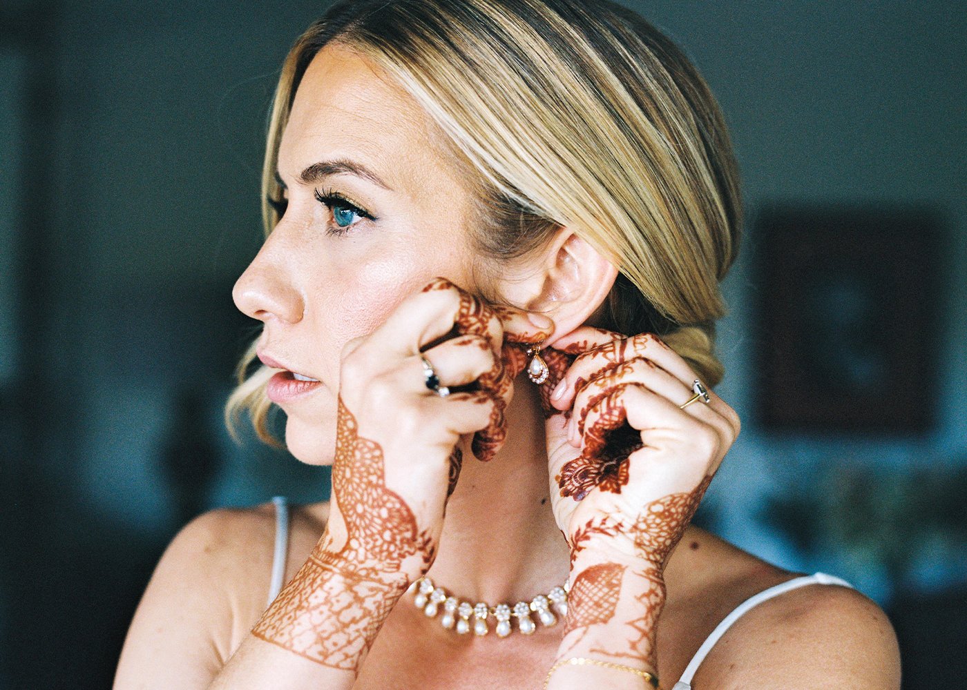
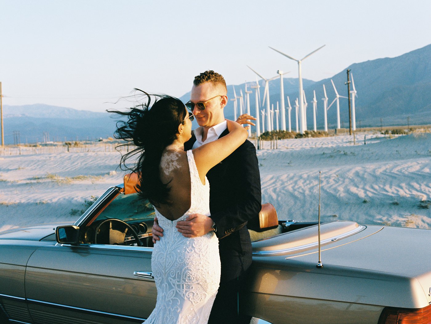
Portra 400 pushed one stop, rated at 640 // Shot with the Contax 645 and 80mm Zeiss lens at 2.0.

Portra 400 rated at 640 and pushed one stop. // Pentax 67 & 105mm at 2.4.
PORTRA PUSHED
Sometimes you can’t get enough light and still want to shoot Portra. If I need that extra half to full stop of light, I’ll push it one stop. Since I like Portra 400 at 320 typically, when I push it, I rate it at 640. I then write +1 on the film cartridge and ask the lab to push it one stop in development. What does that mean? It means they leave the film in the developer longer and really helps get more out of the midtones and highlights. It typically doesn’t get much more info out of the shadows so you end up with a bit more contrast in your negative. More contrast, means more saturation. Not bad in my eyes, but just something to note it you prefer the softer more pastel look of film.
VERSATILITY AND LATITUDE
What do we mean when we say Versatility or Latitude. It means how many stops of light can the film handle from the darkest shadows to the brightest highlights. Portra 400 is a professional film and does a great job of retaining the highlights (not just making parts of your photo pure white) and keeping information in the shadows (so it’s not just pure black).

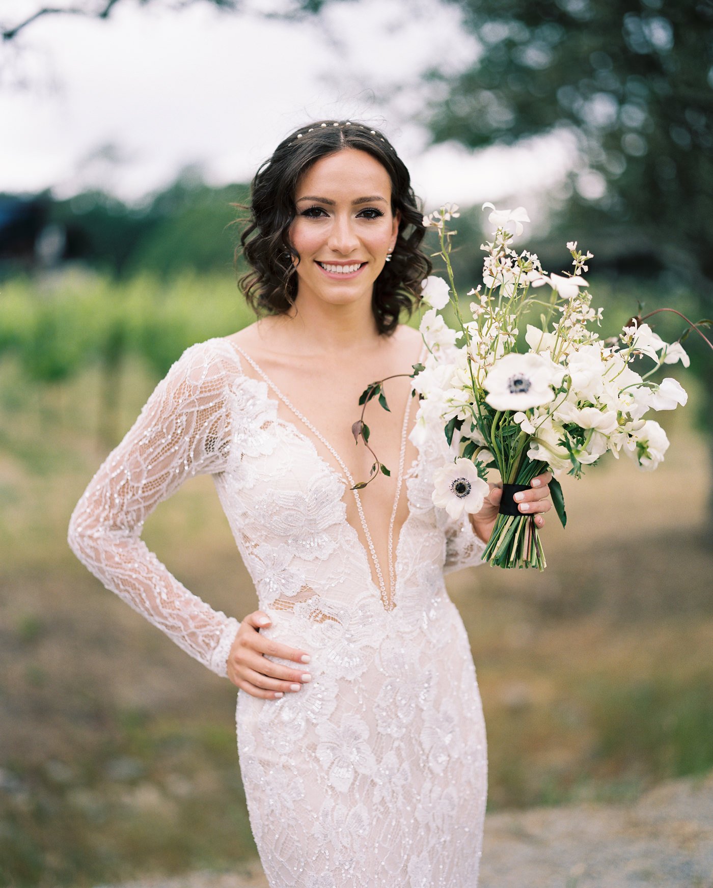
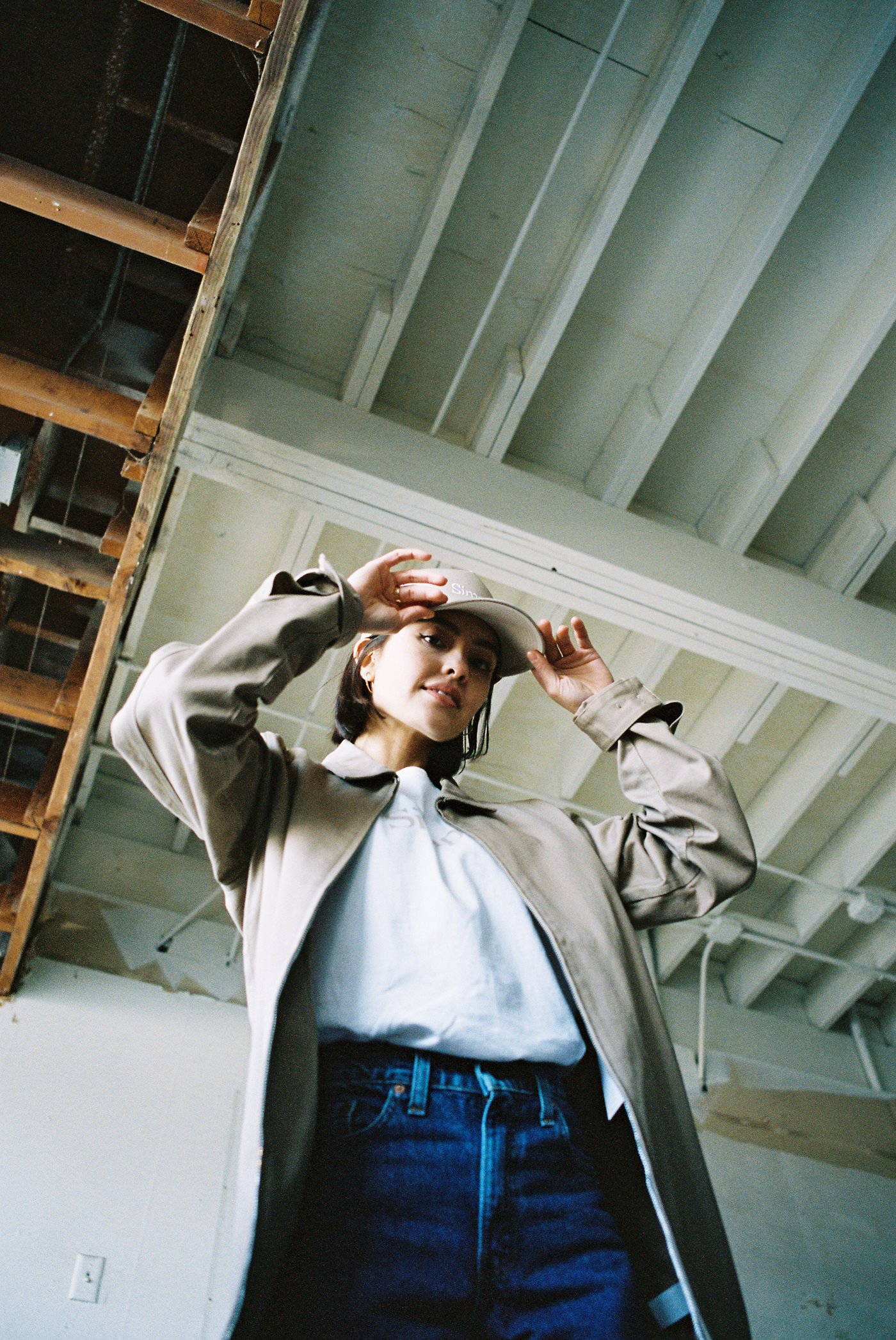
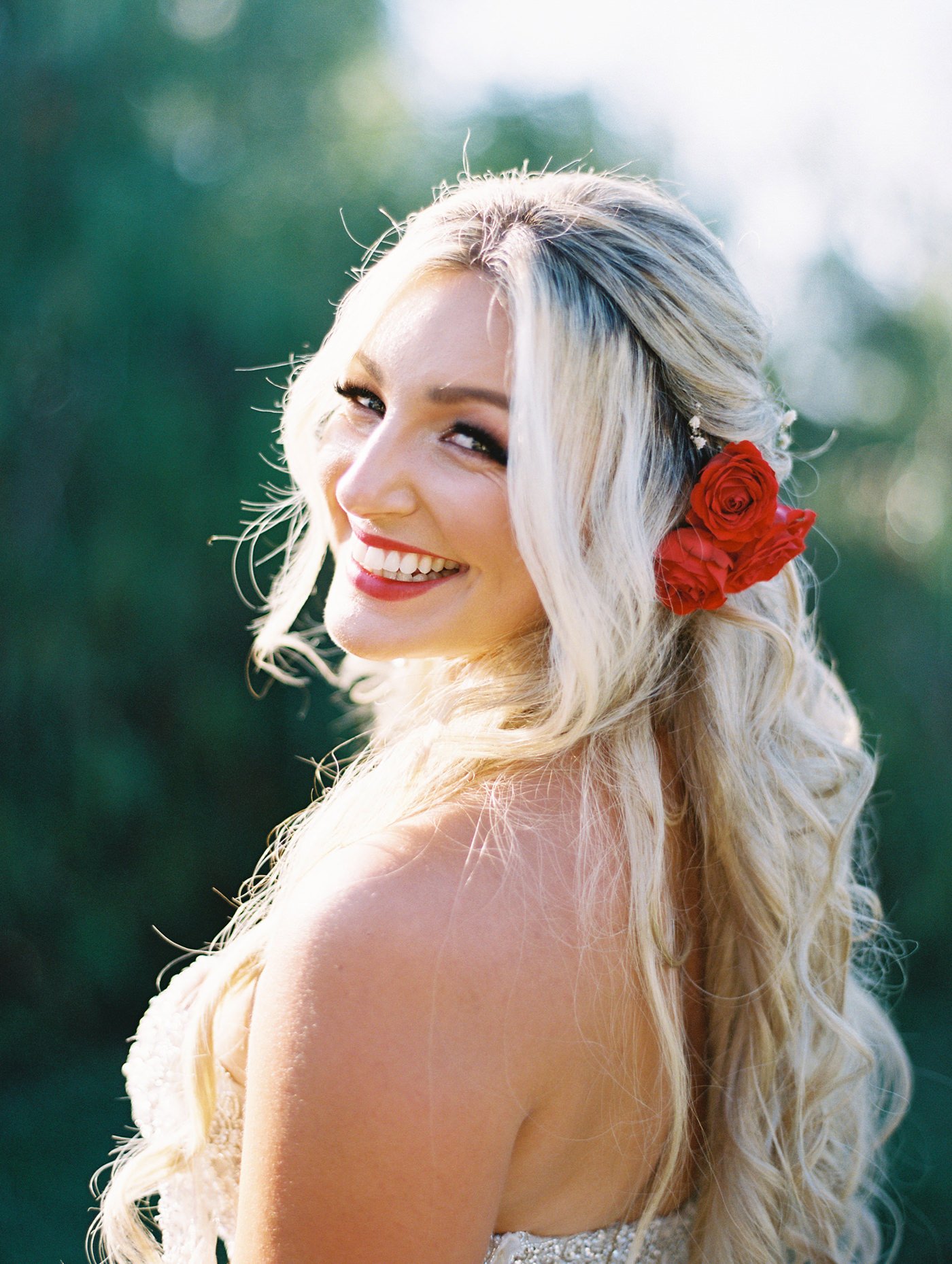
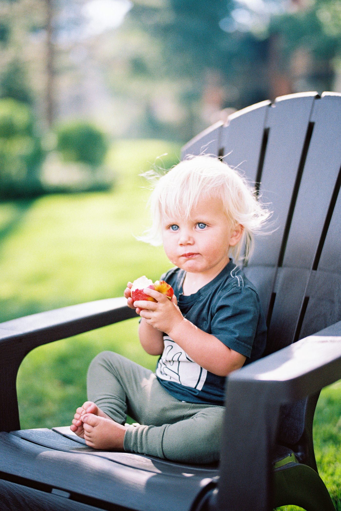
SKIN TONES
A super important part of choosing your film is seeing how it renders skin tones. I really like the way most skin tones look on Portra 400. It’s limitations in my opinion are when you push it since there can be a little too much saturation, making darker skin tones turn a bit orange rather than a nice brown. Just something to be aware of.


COLORS
Now this is where Portra truly shines. It gives you rich, vibrant (but not ridiculous) colors. People say that Portra handles reds, yellow, oranges better than Fuji and Fuji handles the greens and blues better. It’s definitely a personal taste thing, because I like Portra better for everything.

UNDEREXPOSURE
As much as we raved about how versatile and how much latitude Portra 400 has, it still can be underexposed. In this photo the trees and barn are both about 2 stops or so underexposed. They were both tough scenes in mid day gloomy bright weather but I pretty much lost the sky in the highlights for both of them, so I should have just metered for the shadows.

OVEREXPOSURE
These examples both have the same mistake. I metered for the midtones or for the entire photograph in general. This made it so the brightest part of their faces were overexposed beyond Portra’s limits. I should have metered for the highlights and the midtones and used the settings somewhere between the two.
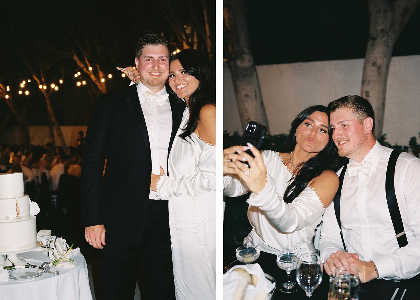
PORTRA 400 WITH FLASH
I don’t shoot a ton of Portra 400 with flash, but when I do, it’s typically with my Fuji GA645 since it has a built in flash and does amazing. Both the examples here are shown with that setup. I think Portra handles the flash beautifully.
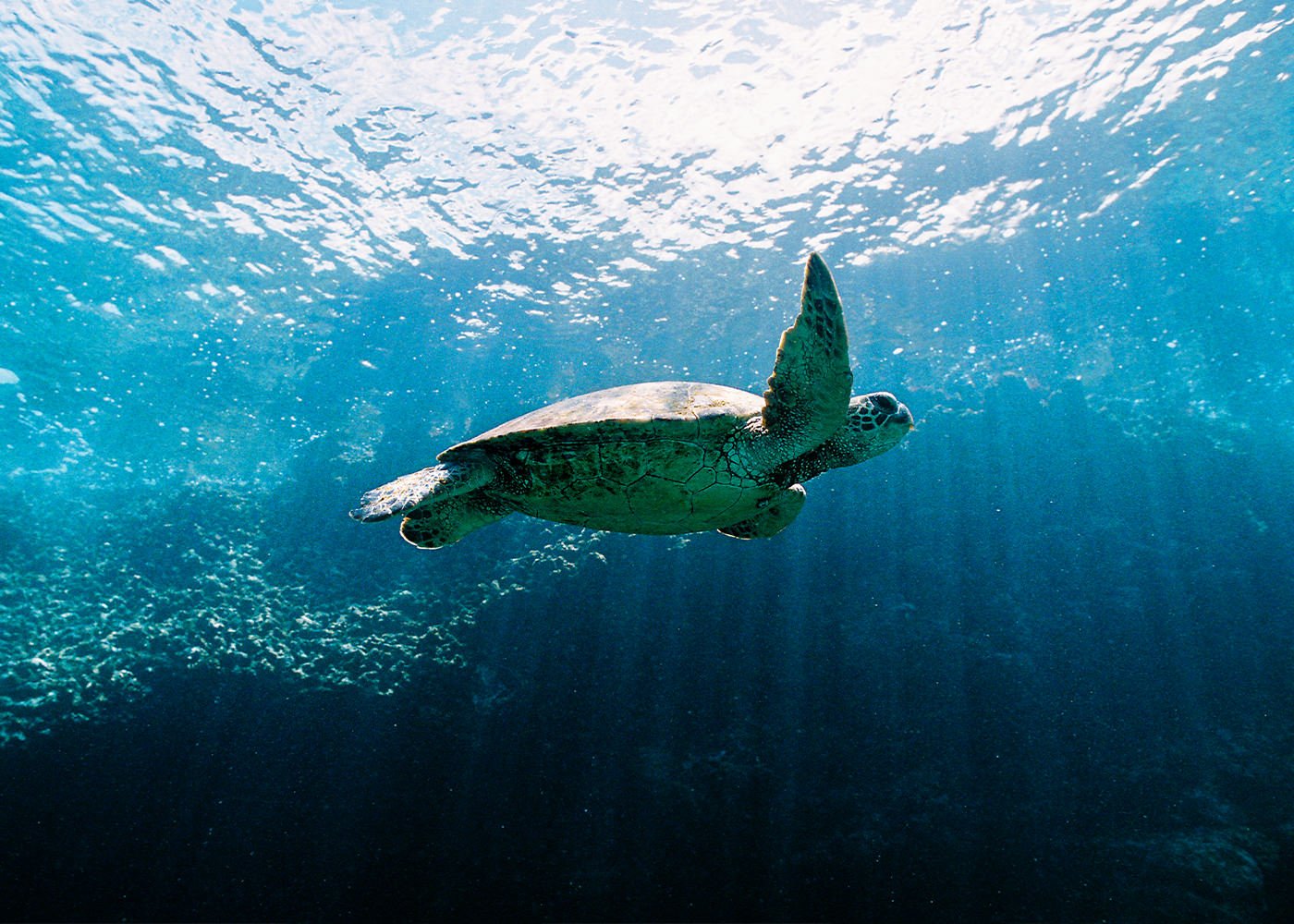
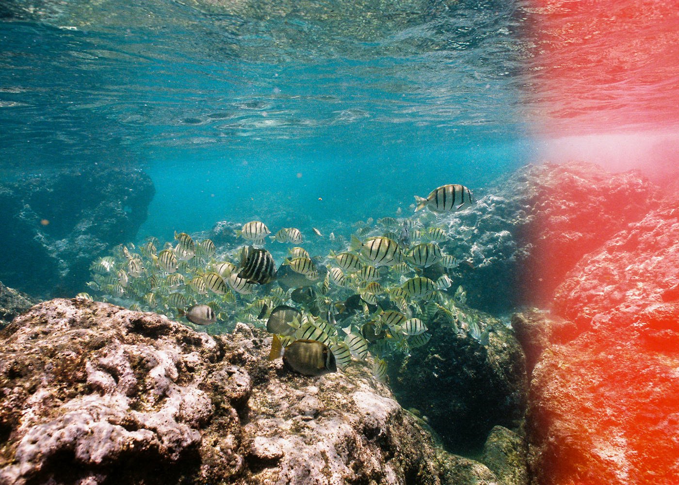
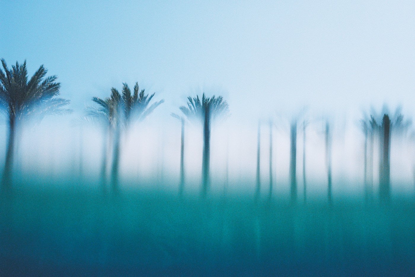
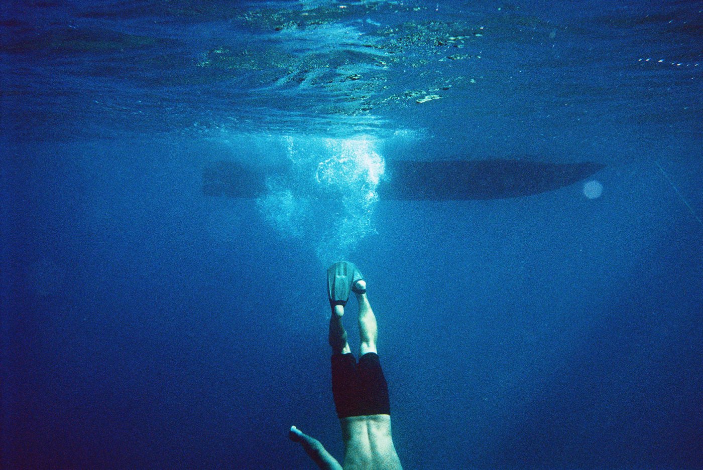
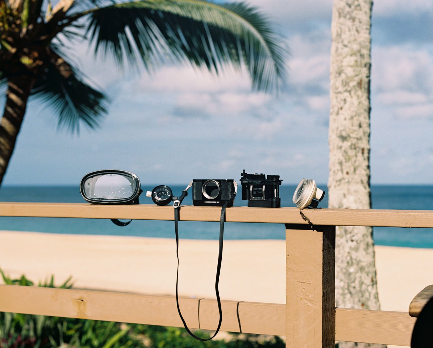
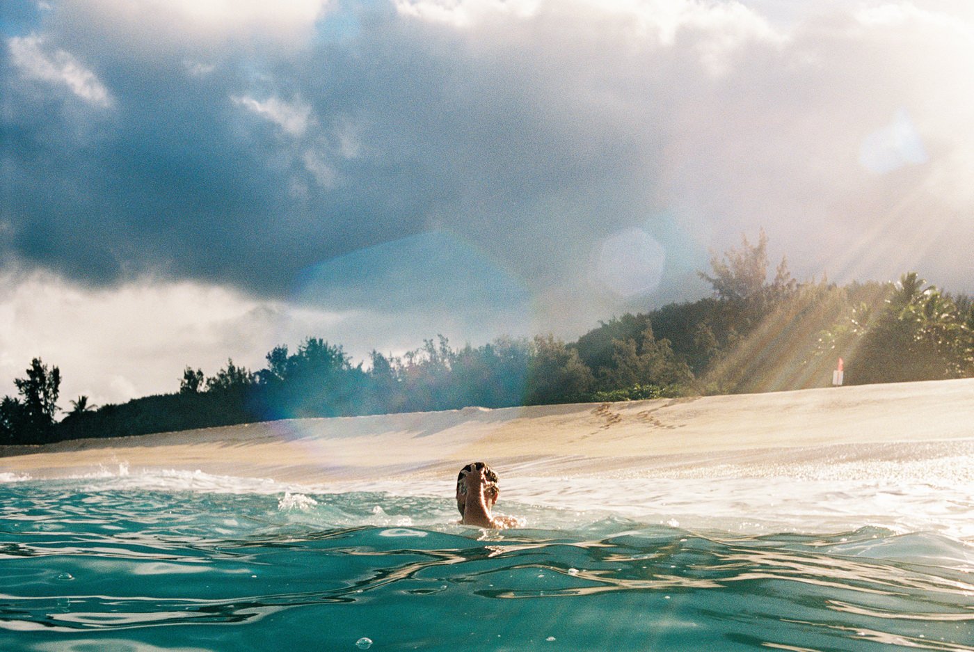
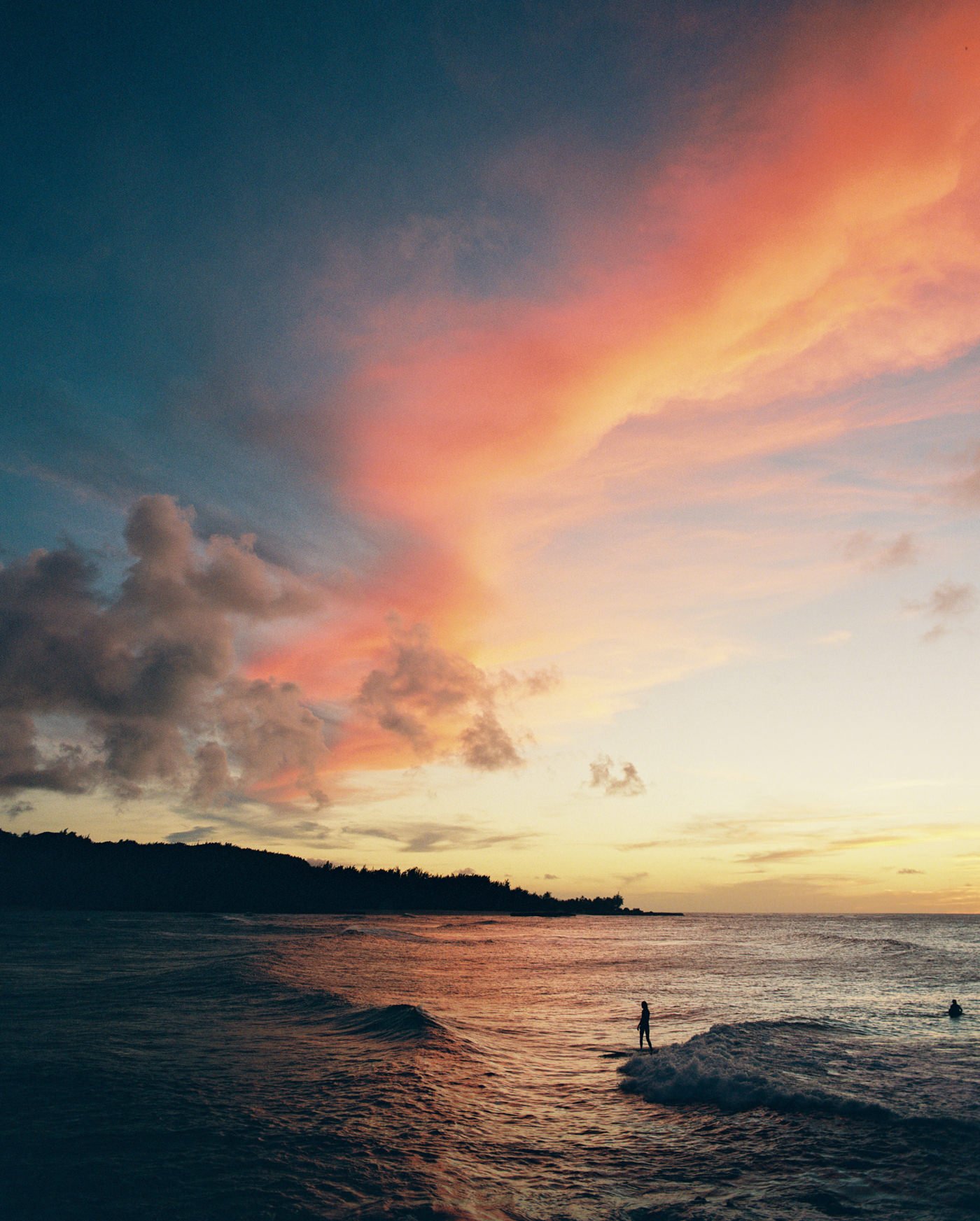
PORTRA 400 UNDERWATER
Oh weird, it does amazing here too! Something to note though, you lose certain colors the deeper you go. If you go to deeper depths you’ll want to use a flash.
Sample image from Carmencita Film Lab // photos: Jan Scholz
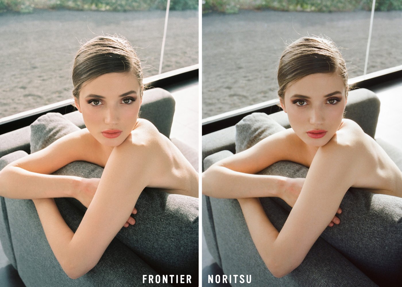
FRONTIER VS. NORITSU // WHICH SCANNER DO YOU PREFER?
Die hard film lovers will swear by one, I promise. I’m Frontier for life. Every time I use Noritsu, I’m bummed. Whichever you choose, it’s going to have a huge impact on the look of your scans. The direct difference of each scanner can be read below, provided by Carmencita Film Lab.
Noritsu HS-1800
Higher resolution than the Frontier available
Overall color is warmer tones yet more flat
Black point is more muted and can deviate to greenish on underexposed images
Skin tones are more peach or pink toned
Colors are softer and lighter
Black and white film scans are more neutral and flexible
The grain is sharper and more noticeable on higher ISO emulsions
Fuji Frontier SP3000
Overall cooler tones with cyan and blue shadows
Black point is very rich (there tends to be a bluer black in the black shadow areas)
Skin tones are more golden
Colors are more vivid, punchy, or saturated
Black and white film scans can lose shadow detail
The grain is always smooth and clean due it’s grain suppression algorithm
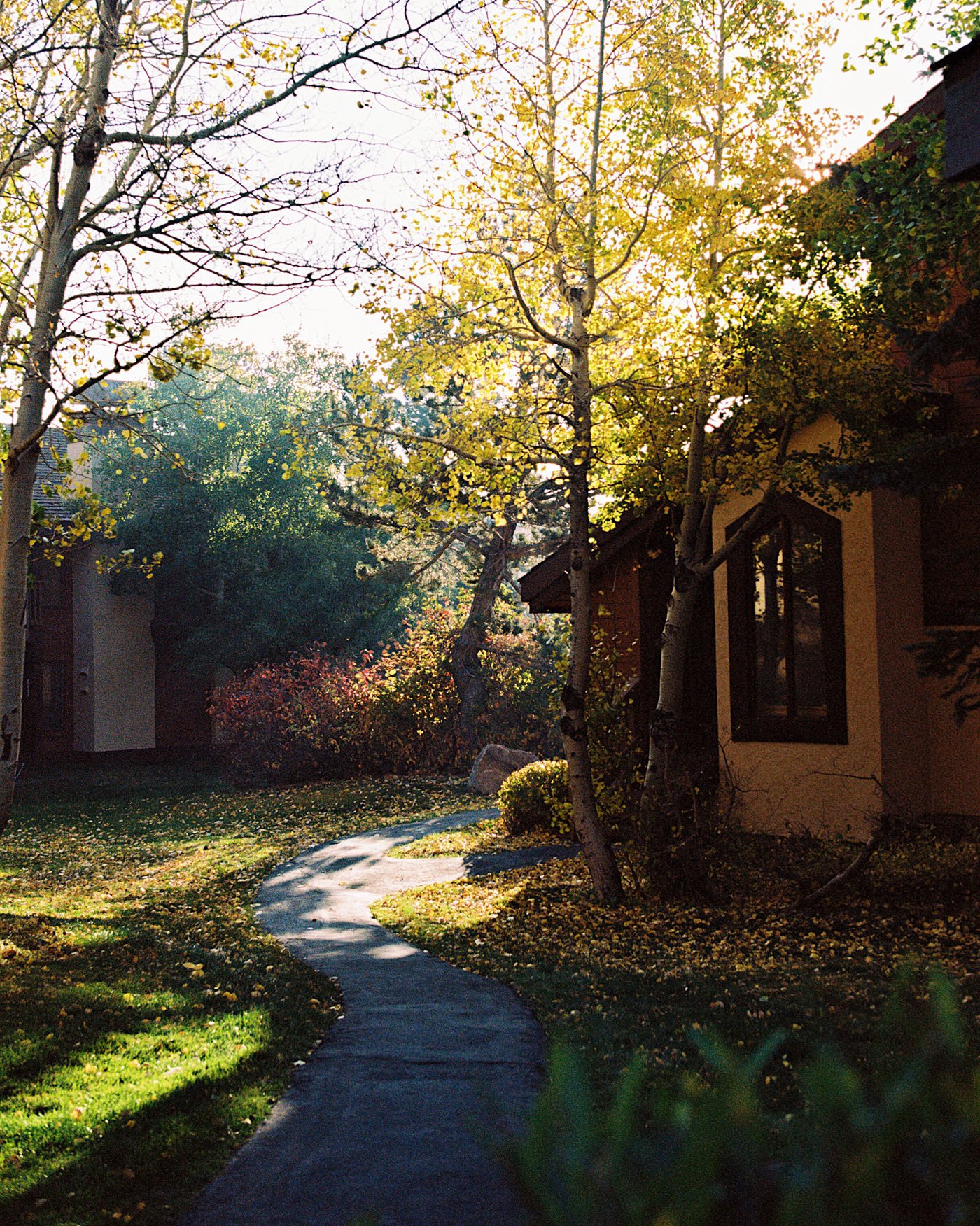
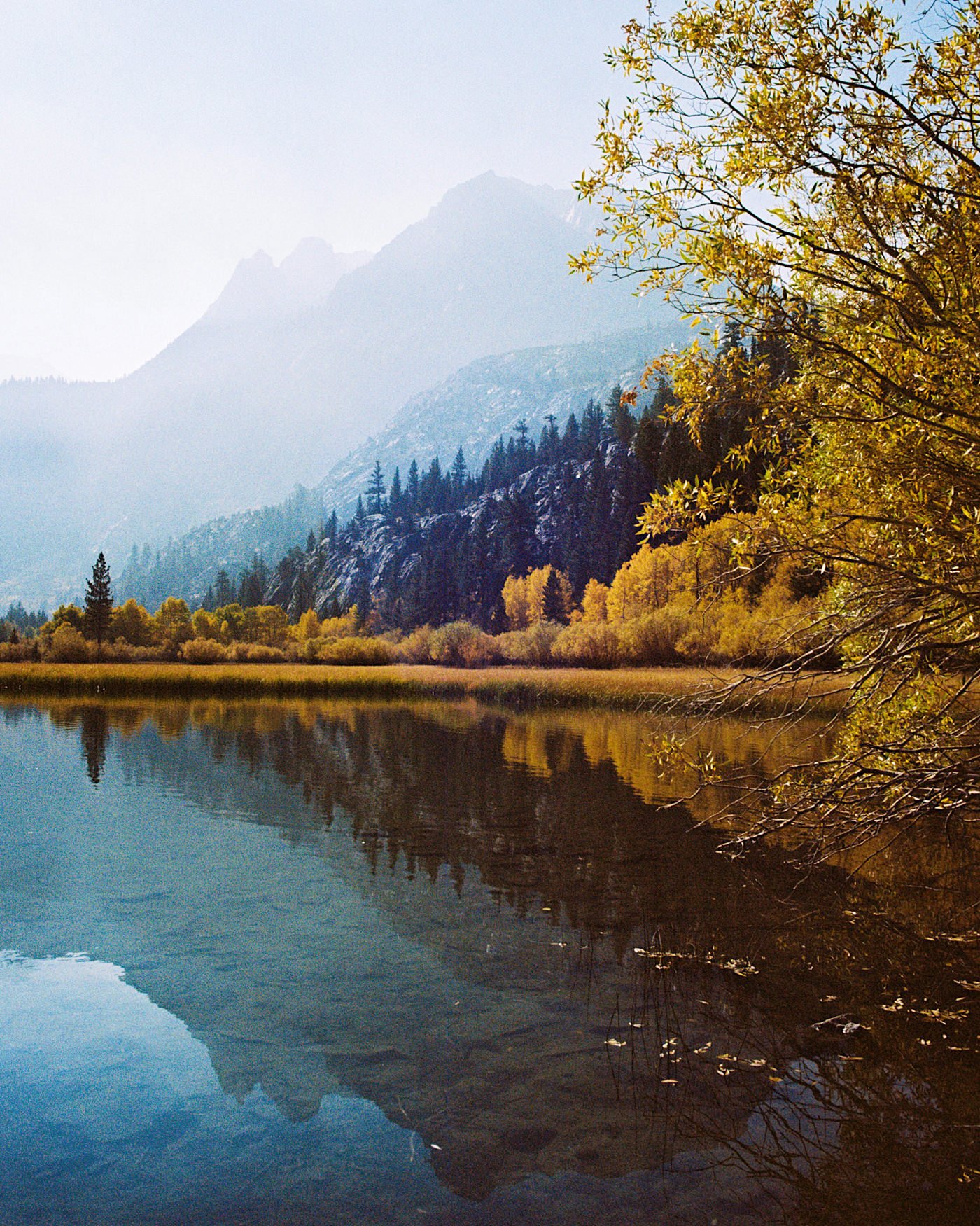
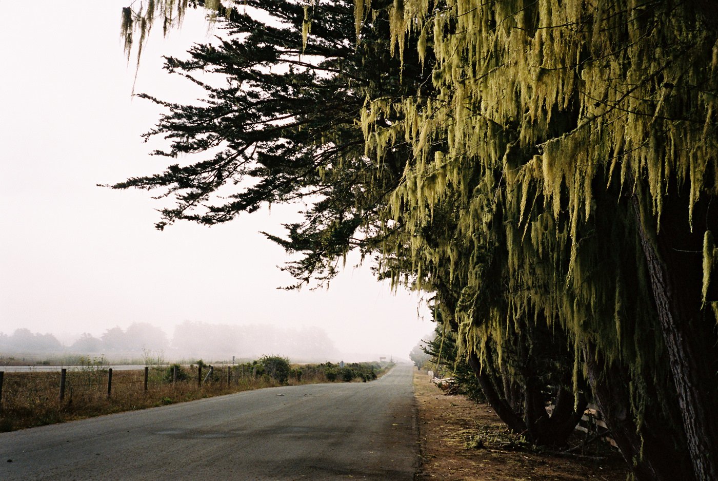
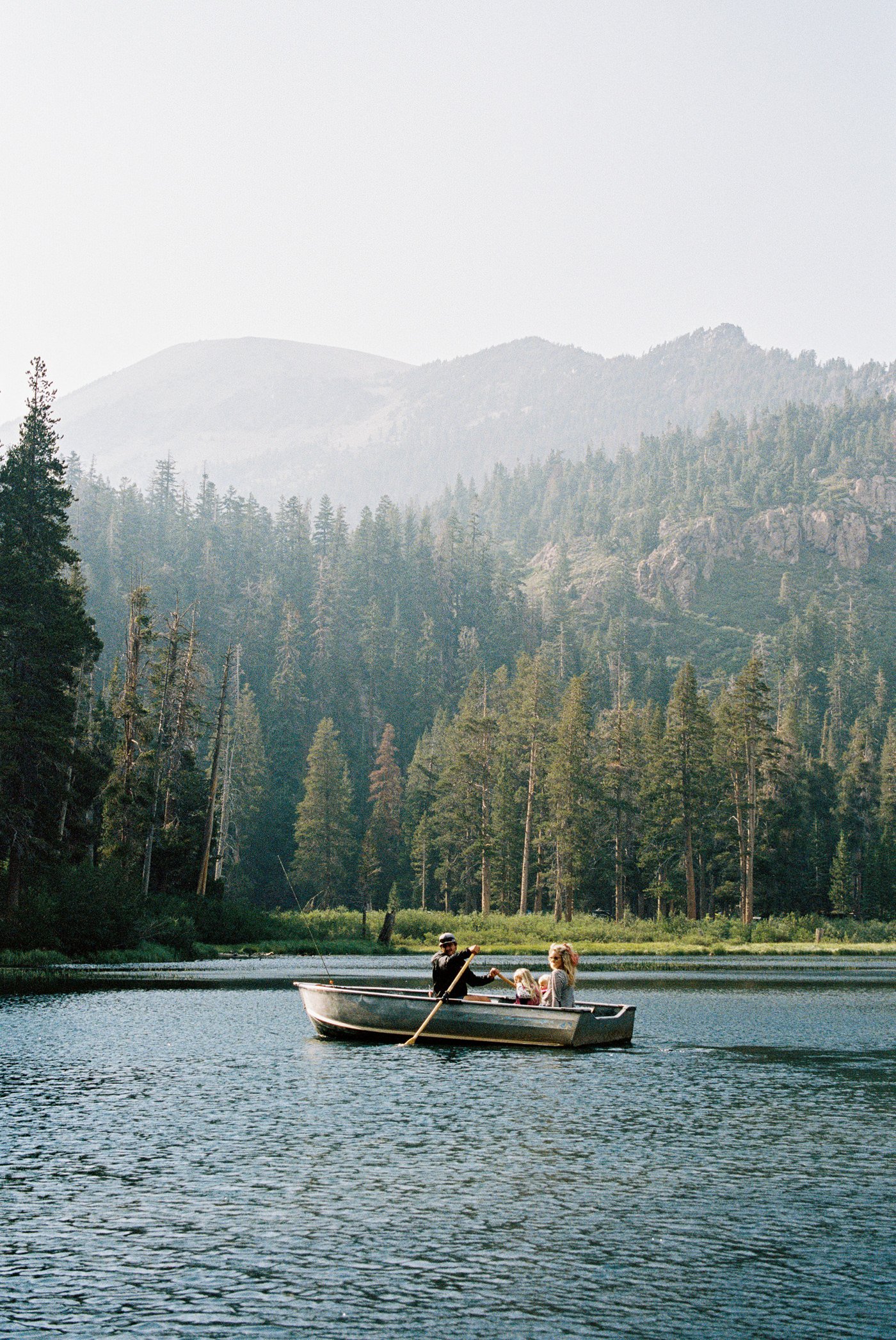
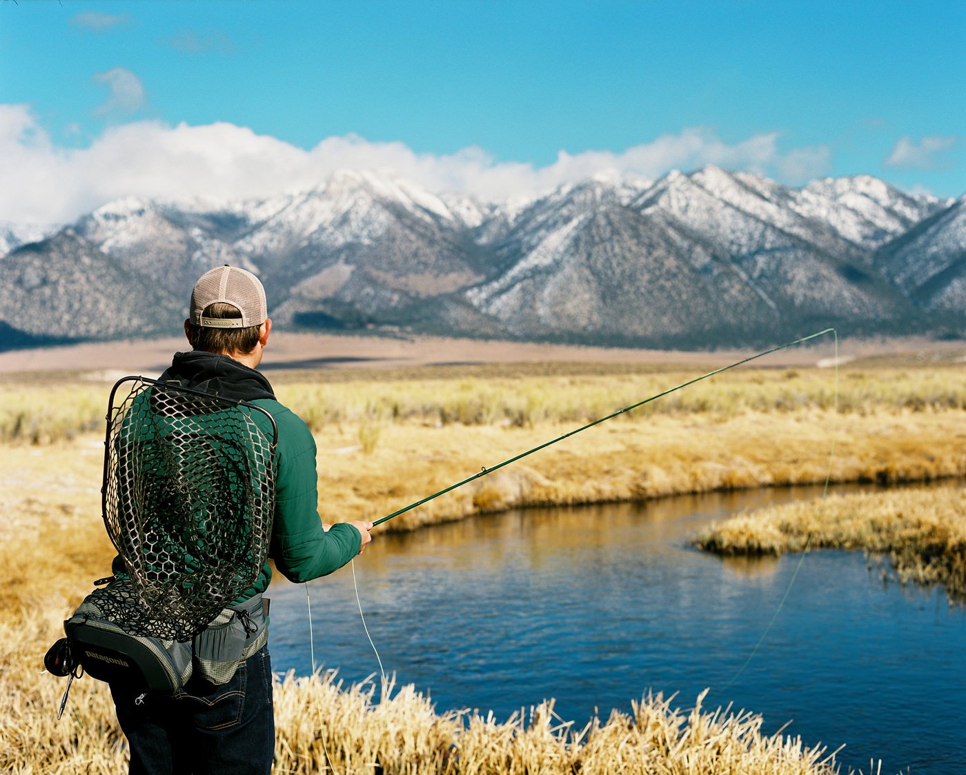
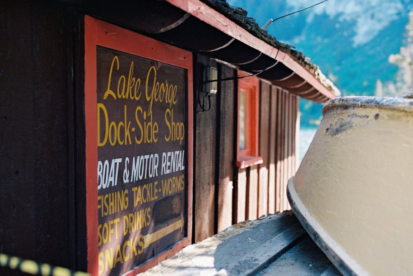
Shooting Portra 400 in Mammoth
A montage of shooting Portra 400 film in Mammoth.
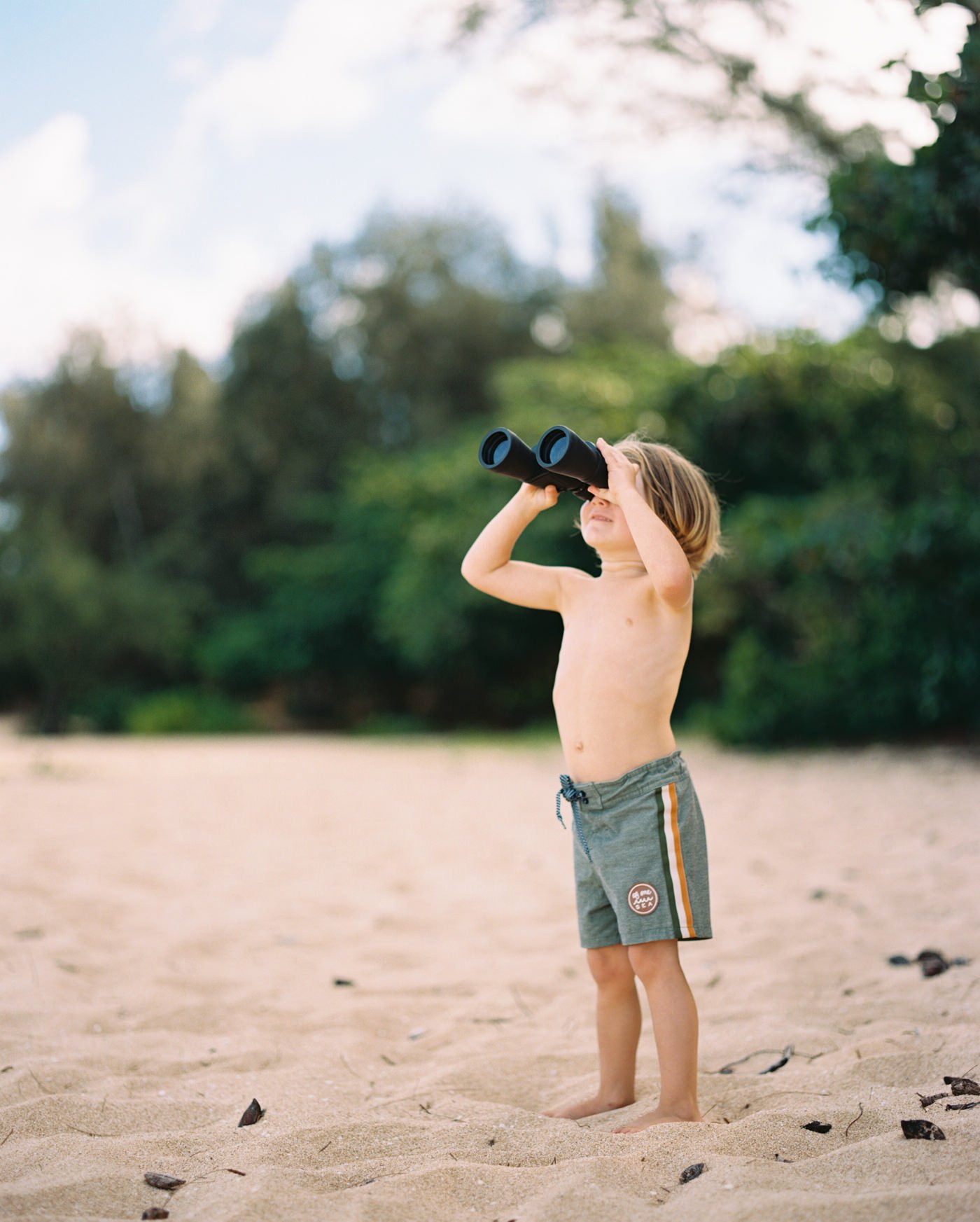
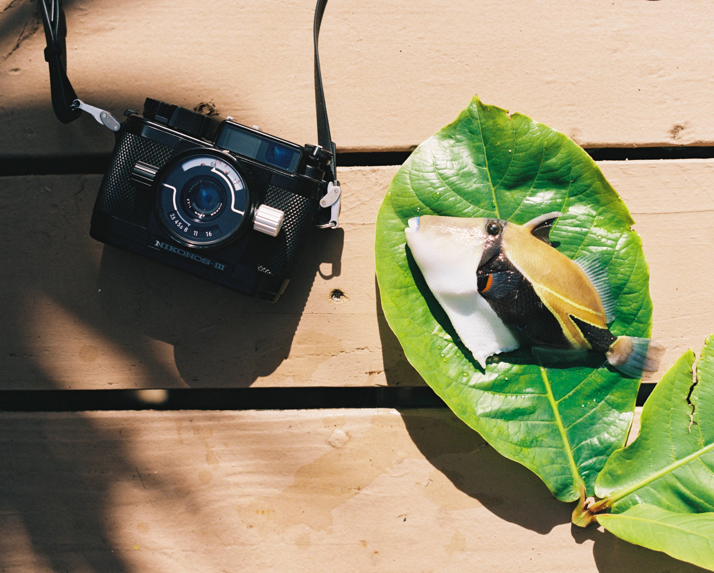
PORTRA DUMP
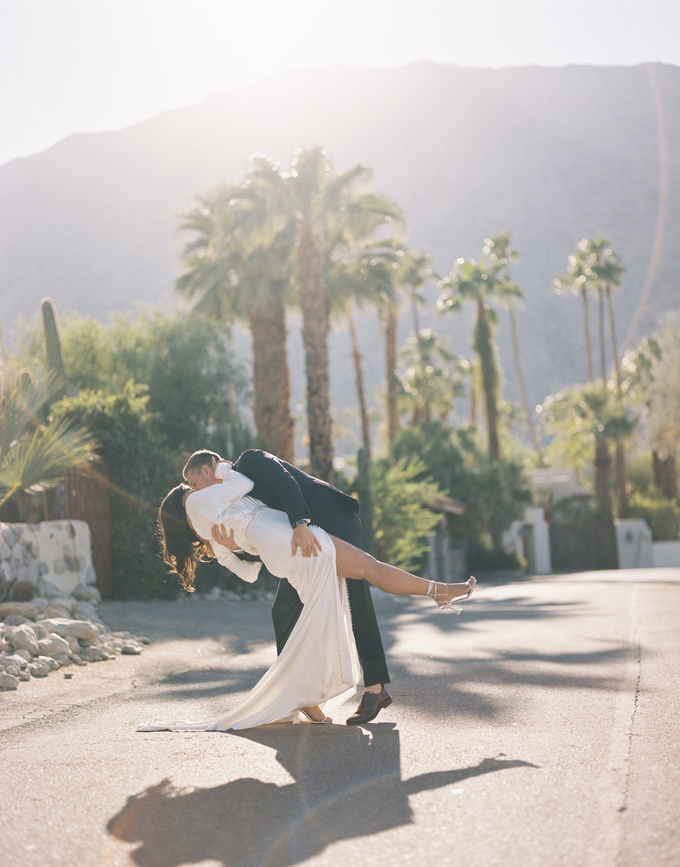
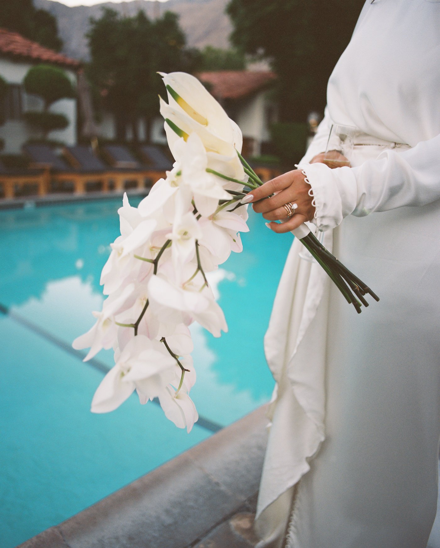
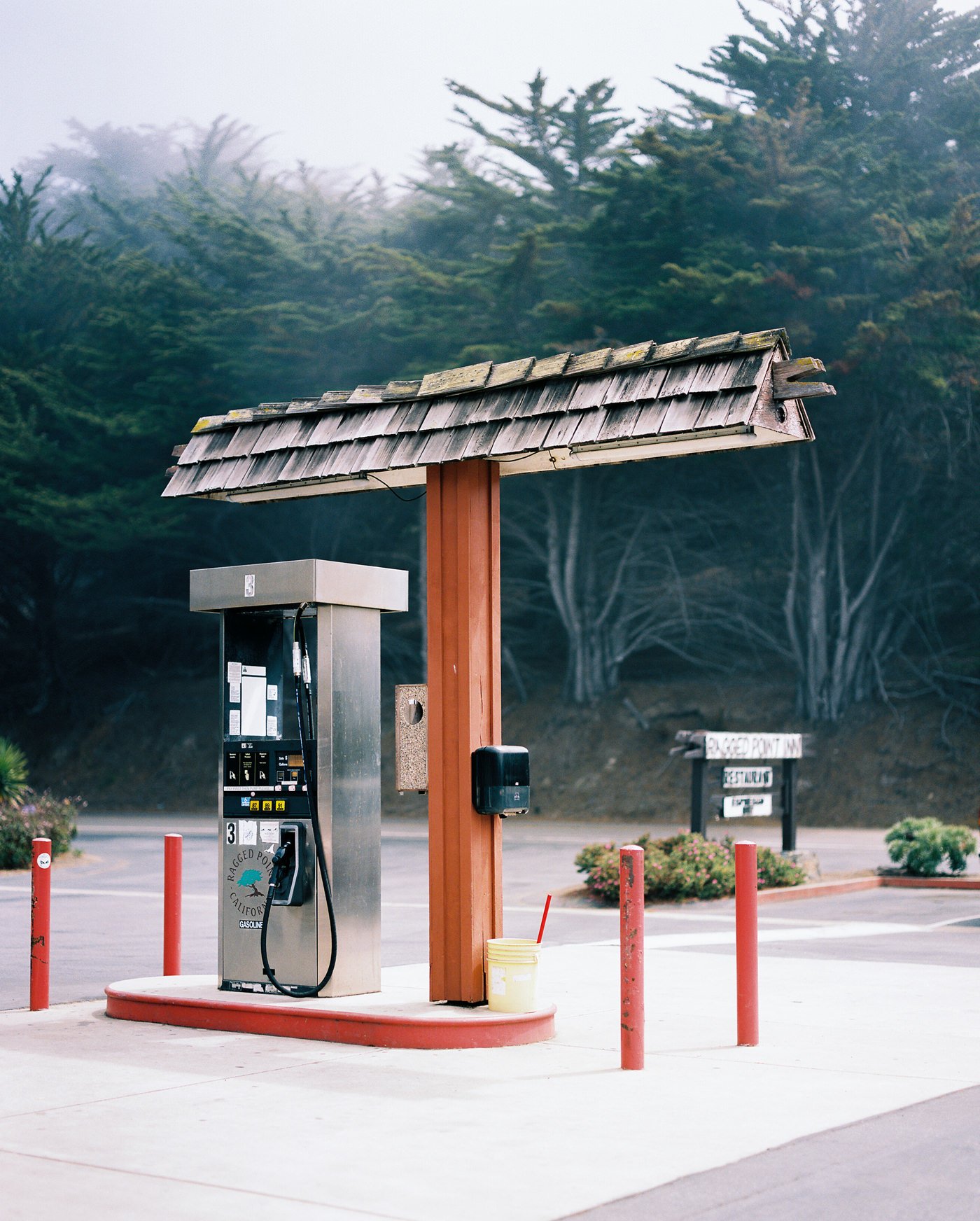
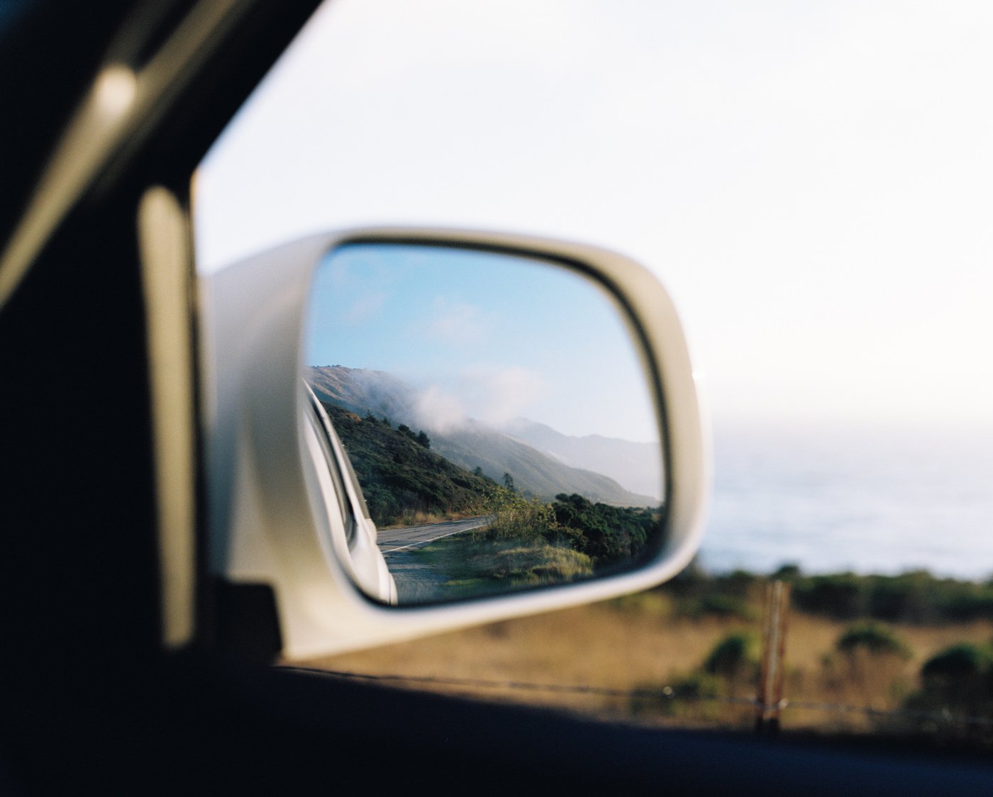
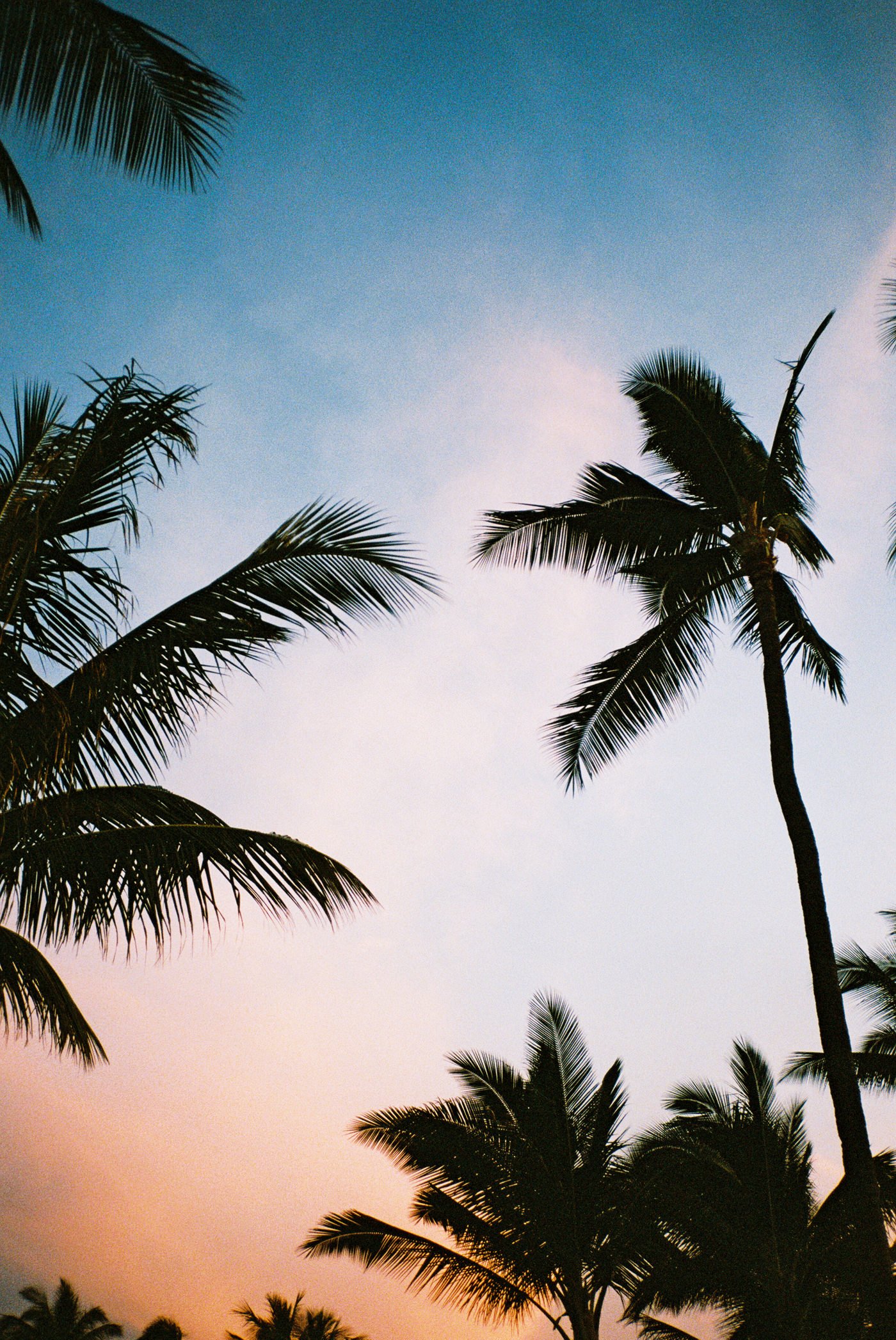
Now, enjoy this dump of some of my favorite photos on Portra 400.


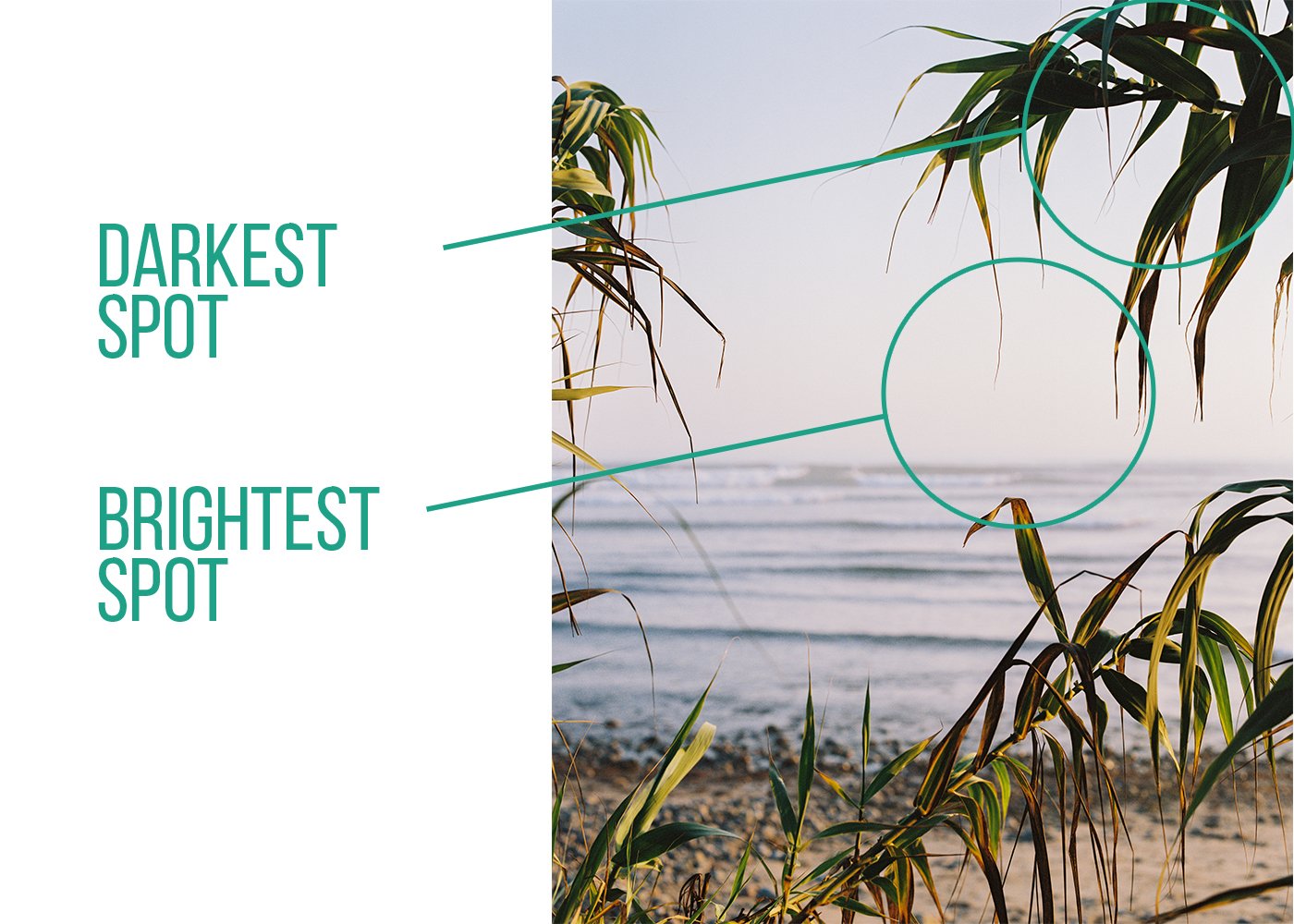
A visual breakdown of lighting & composition to help you take better photos.